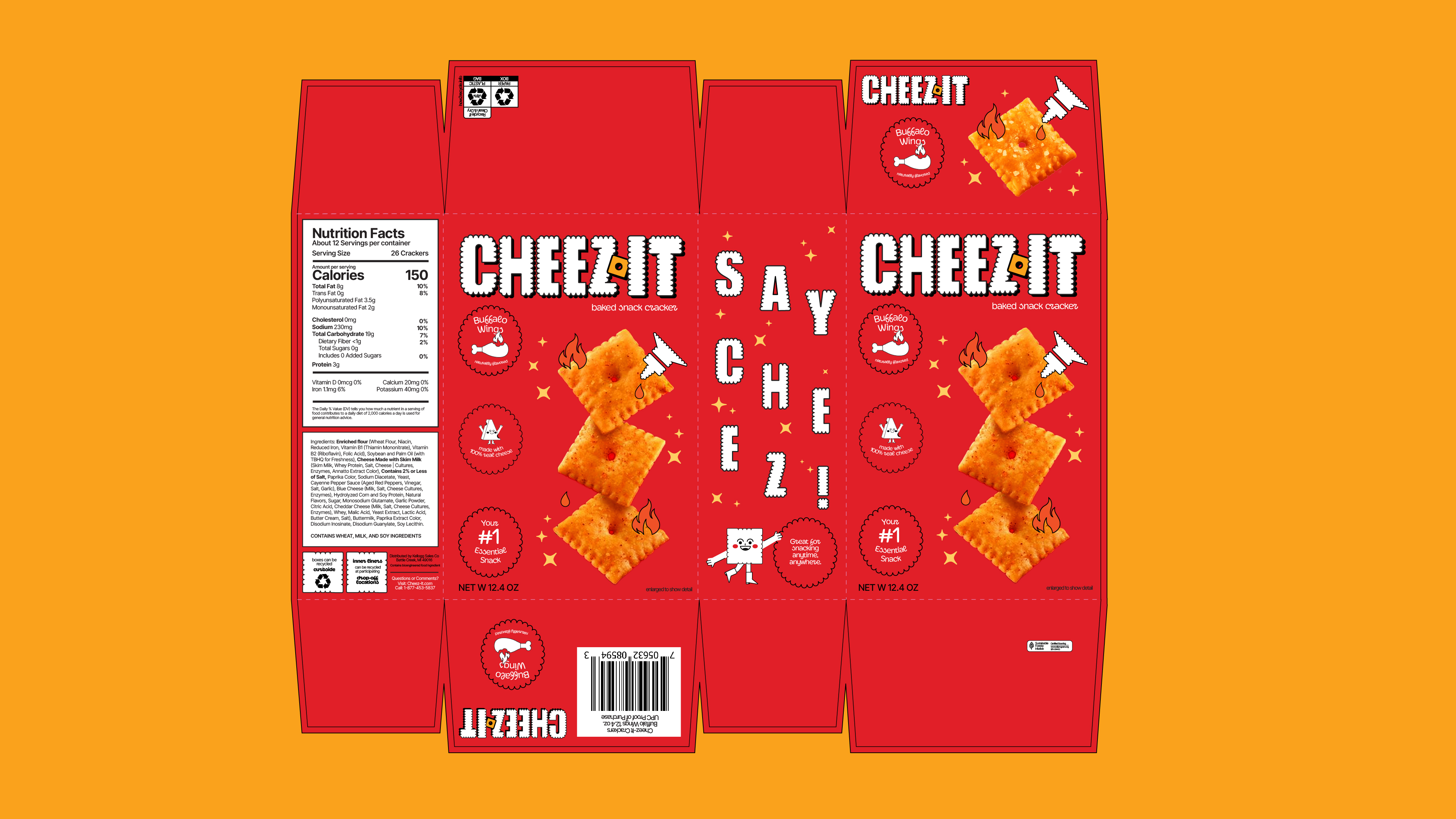
Cheez-It Buffalo Wings Packaging Redesign
Overview & Problem
To redesign Cheez-It’s packaging. The old packaging was boring, but the Buffalo Wing flavor is too addictive to ignore.Solution
Combine trends seen in CPG space with some of the existing Cheez-It brand elements to create a fresh, new take on the packaging for the Buffalo Wings flavor. This includes illustration work, a typeface that reflects the ridges in the cracker, and an overall modern feel.


Credits:
Abby Green
*Not affliated with the brand


