Repatient
OverviewRepatient helps patients afford care without sacrificing their health due to cost, while also accelerating provider cash flow and reducing patient delays or denials of care. Our challenge — bridging the gap between patient and provider.
Scope
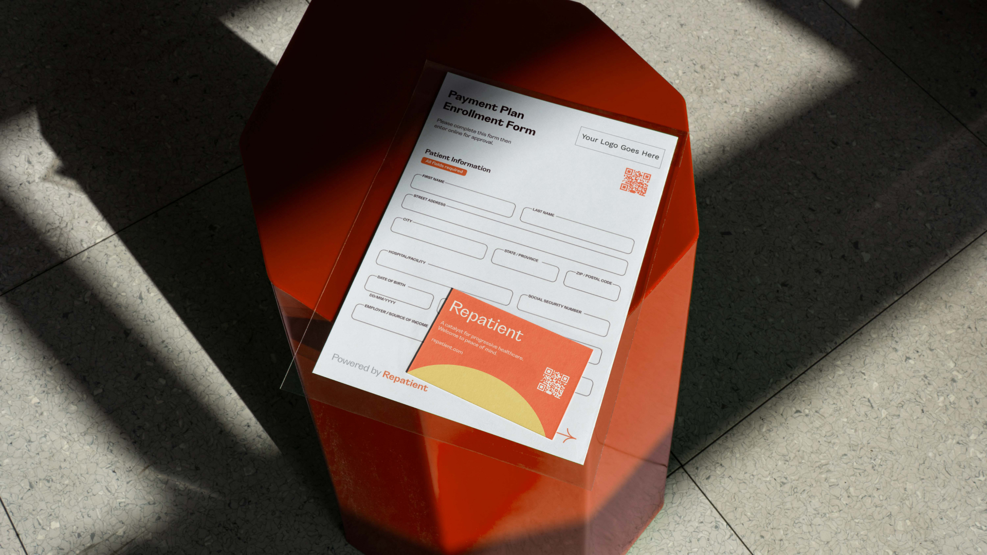
1 — Strategy2 — Brand Identity System & Guidelines
3 — Collateral and Print Production
4 — Web Design

In the Discovery phase, we researched what other industry leader’s were successfully and ineffectively doing with their brands. We found that many hospitals had stale and uninviting personalities, while many financial companies were too conservative. Since Repatient offered such a reassuring serivce...
We created a brand personality that would be inviting and friendly.

To achieve the needs of Repatient and their values, we created:
1 —
A palette guided by oranges and yellows softened with a cream background. All visually communicating warmth and encouragement while still being formal and honest2 —
An illustration system that feels progressive and accessible while also complementing the illustration and copywriting3 —
A tone of voice that recognizes the need for approachability in this type of service


Credits
Design Leads: Armando Diaz & Abby Green
Illustration: Abby Green
Copywriting: Kayla Alexander
Website: Alexis Ramírez Hernández
Project Manager: Reba Martinez
Design Leads: Armando Diaz & Abby Green
Illustration: Abby Green
Copywriting: Kayla Alexander
Website: Alexis Ramírez Hernández
Project Manager: Reba Martinez


